The Grid
The website uses a mathematical system to establish consistent rhythm and scale and a strong consistent structure for page elements. This concept draws inspiration from the Invesco brand mark and helps enforce the Swiss-styled aesthetic by which Invesco is recognised.
As illustrated in the screenshot, there are a total of 12 columns in a full grid. The grid columns are 60 pixels in width and with 20 pixels in between the columns.
Screenshot

Code
Code that makes up the template.
Masthead
<div class="short body_bg">

  <div class="wrapper topbar">
    ...
  </div>

  <div class="masthead">
    ...
  </div>

  <div class="header">
    ...
  </div>

</div>
Content
<div class="short content">
  <div class="container">
    <div class="row">
      <div class="span2" id="sidebar">
        ...
      </div>
      <div class="span7" id="main">
        ...
      </div>
      <div class="span3" id="secondary">
        ...
      </div>
    </div>
  </div>
</div>
Footer
<footer>
  <div class="footer_first">
    ...
  </div>
  <div class="footer_second">
    ...
  </div>
</footer>
How It Works
Three code snippets are shown above. They are divided into 3 sections:
- masthead (as known as the header and located at the top of the page)
- content (the content body)
- footer (located at the bottom of every page)
Screenshot
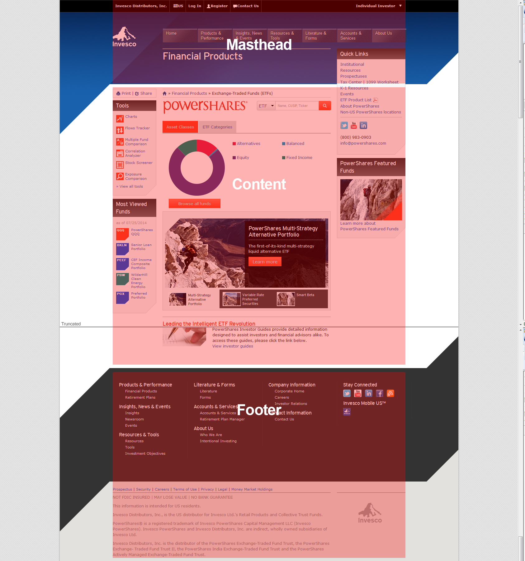
The masthead usually contains the toolbar, Invesco logo, primary navigation, and a page title. The content area contains text, images, and widgets that contain the overall content of the page. The footer area usually consists of links and global information about Invesco.
Columns
The default grid system provided in Twitter Bootstrap utilizes 12 columns that render out at width of 940px.
Screenshot
Grid Structure
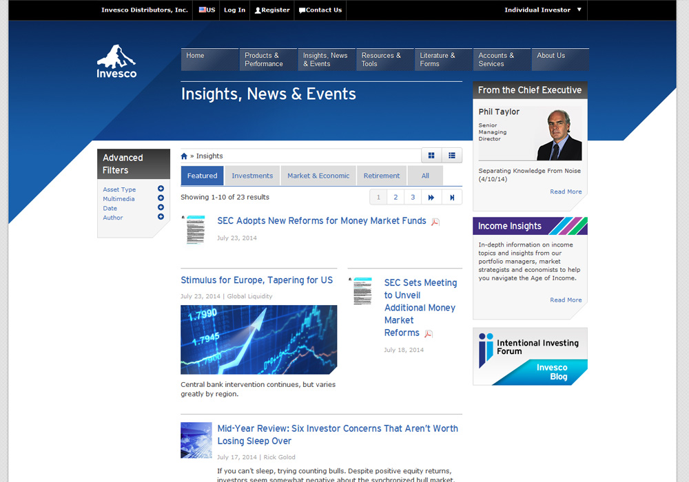
Depending on what page class you are on, the widgets and content that go on each page varies in width and height.
The general rule of thumb is to have a 2-7-3 grid structure.
- The first columns (2) can be use for subnavigation, widgets, or leave as an empty space.
- The second set of columns (7) are used for content for the page.
- Finally, the third set of columns (3) are used for quick links or additional information and tools.
<div class="row">
  <div class="span2" id="sidebar">
    ...
  </div>
  <div class="span7" id="main">
    ...
  </div>
  <div class="span3" id="secondary">
    ...
  </div>
</div>
Screenshot
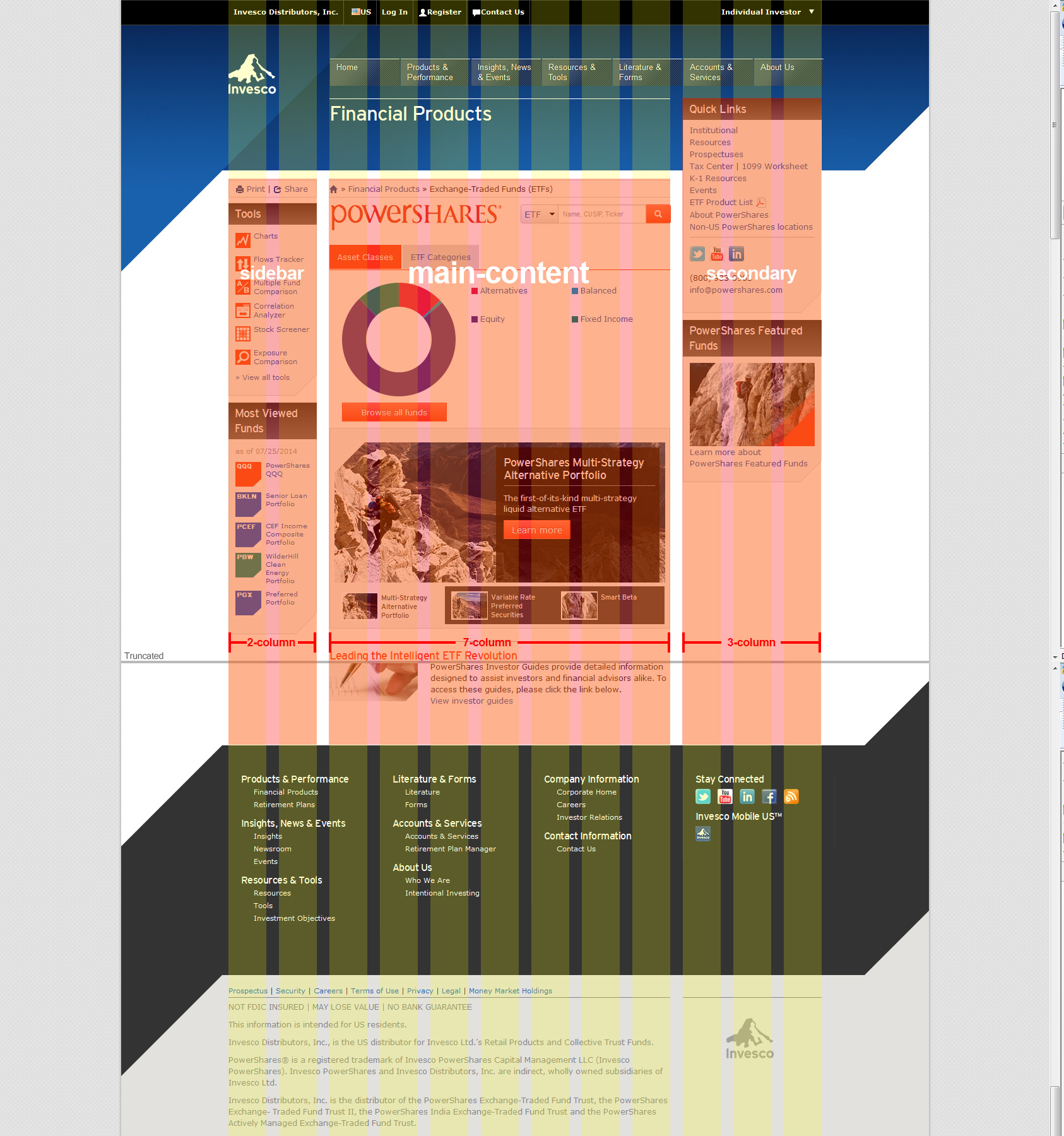
How It Works
<div class="row">
  <div class="span2">...</div>
  <div class="span7">...</div>
  <div class="span3">...</div>
</div>
As shown here, a basic layout can be created with three "columns", each spanning a number of the 12 foundational columns we defined as part of our grid system.
Nested Columns
With the static grid system in Bootstrap, nesting is easy. To nest your content, just add a new .row and set of .span* columns within an existing .span* column.
Example
Nested rows should include a set of columns that add up to the number of columns of it's parent. For example, two nested .span6 columns should be placed within a .span12.
<div class="row">
  <div class="span12">
    Level 1 column
    <div class="row">
      <div class="span6">Level 2</div>
      <div class="span6">Level 2</div>
    </div>
  </div>
</div>
Page Classes
This section demonstrates the various types of "templates" that are used on the US site.
Homepage
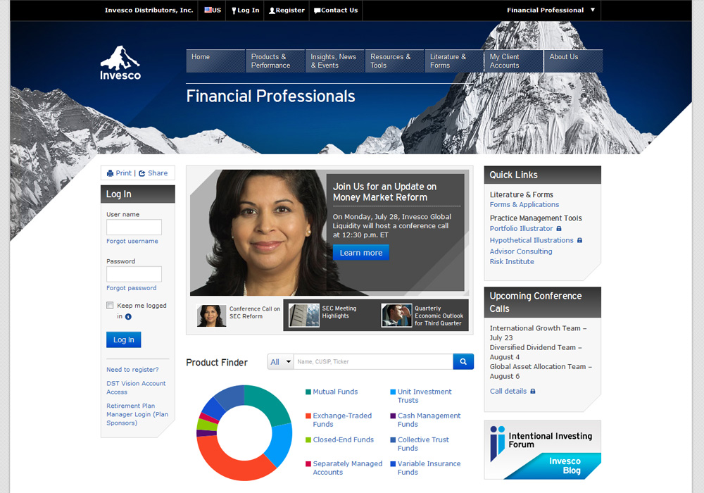
Generic
The .rolepage page class is used only for the homepage for each role. The .subpage class is used in all sub pages.
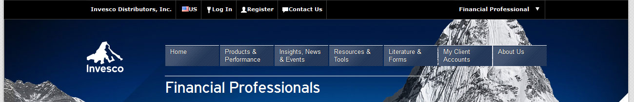
Toolbar (AKA Global NAV)
Toolbar navigation sits at the top of every Invesco web page. It is accessable on all pages and is intended to be a global feature. The U.S. site uses the toolbar to give visitors access to (in order):
- Idenitifes the Legal Entity for the page.
- Select a region that corresponds with the visitor.
- Login access to Invesco accounts.
- Access to Register for an Account.
- A link to the Contact Us page.
- A custom dropdown to select another role.
Screenshot
Megamenu
The Megamenu sits at the top of all pages in the site. It includes dropdowns with rollover states that allow linking through to sub-level content.
Screenshot