Click headers to expand/collapse content that is broken into logical sections, much like tabs. Optionally, toggle sections open/closed on mouseover.
The underlying HTML markup is a series of headers (H3 tags) and content divs.
Screenshot

Code
HTML
<div class="widget">
<div class="accordion" id="accordionUniqueID">
<div class="accordion-group">
<div class="accordion-heading"> <a class="accordion-toggle acc-link" data-toggle="collapse" data-parent="#accordionUniqueID" href="#collapseOne">
Title Here(US article doesnt like H tags here!)
</a> </div>
<div id="collapseOne" class="accordion-body collapse in">
<div class="accordion-inner">
Title Here(US article doesnt like H tags here!)
<p>Text for the accordion</p>
</div>
</div>
</div>
<div class="accordion-group">
<div class="accordion-heading"> <a class="accordion-toggle acc-link" data-toggle="collapse" data-parent="#accordionUniqueID" href="#collapseTwo">
& Title Here(US article doesnt like H tags here!)
</a> </div>
<div id="collapseTwo" class="accordion-body collapse">
<div class="accordion-inner">
<h4>H4 Title Here</h4>
<p>Text for the accordion</p>
</div>
</div>
</div>
<div class="accordion-group">
<div class="accordion-heading"> <a class="accordion-toggle acc-link" data-toggle="collapse" data-parent="#accordionUniqueID" href="#collapseThree">
Title Here(US article doesnt like H tags here!)
</a> </div>
<div id="collapseThree" class="accordion-body collapse">
<div class="accordion-inner">
<h4>H4 Title Here</h4>
<p>Text for the accordion</p>
</div>
</div>
</div>
<div class="accordion-group">
<div class="accordion-heading"> <a class="accordion-toggle acc-link" data-toggle="collapse" data-parent="#accordionUniqueID" href="#collapseFour">
Title Here(US article doesnt like H tags here!)
</a>
</div>
<div id="collapseFour" class="accordion-body collapse">
<div class="accordion-inner">
<h4>H4 Title Here</h4>
<p>Text for the accordion</p>
</div>
</div>
</div>
</div>
</div>
Using the optional .in class on the collapsable content (as in the #collapseOne div in the example above) gives you the option of having that div open on page load.
The call-out pattern highlights an important document, image or related link. Simply apply callout-wrapper to a div containing the thumbnail image and related text and/or link, separated by a <br />.There are two types of call-out patterns: asides (e.g. blockquotes, etc.) and full column call-outs that span the entire width of the parent.
Screenshots
Aside Call-out
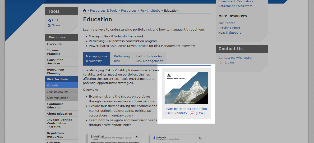
As shown on Education page of the Risk Institute section.
It should be noted that the default class expands to fit the image included in the wrapper. For a larger call-out, use the span[x] and first-span classes, unless the call-out needs to span the entire width of the parent.
Code
 <div class="callout-wrapper-wide">
                  <a href="" alt="Preview" target="_blank"><img src="../../../../assets/img/resources/ri_e1inset.jpg" /><br />
                    Learn more about Managing Risk & Volatility <span class="pdf">(123k)</span></a>
                    </div>
Wide Call-out
As shown on Continuing Education Page (within a media pattern).
Code
 <div class="callout-wrapper-wide">
                  [Content Here]
                    </div>
The carousel is used as a slideshow for cycling through elements. This is a responsive, custom slider built by Trey Cranson. It does not cycle automatically.
Screenshot
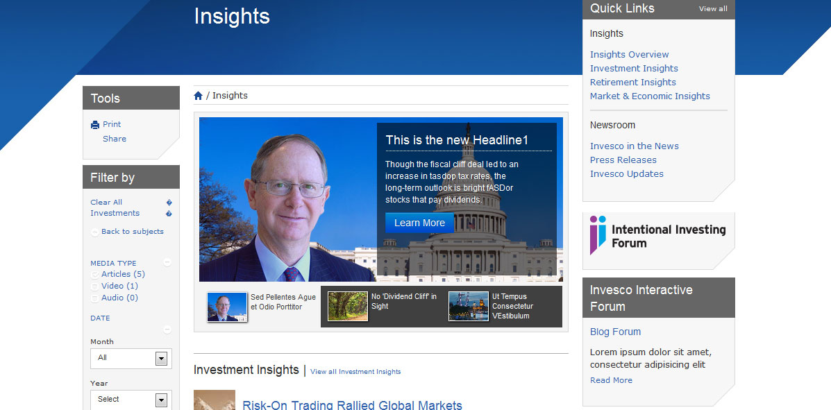
As shown on the Github mock.
Markup
<div class="widget">
          <div id="featurecarousel" class="jcarousel-skin-invesco-feature">
            <ul>
              <li> <img src="../assets/img/feature1.jpg" alt="" />
                <div class="featureblurb pull-right">
                  <h3>This is the new Headline1</h3>
                  <p>Though the fiscal cliff deal led to an increase in tasdop tax rates, the long-term outlook is bright fASDor stocks that pay dividends.</p>
                  <button class="btn btn-primary">Learn More</button>
                </div>
              </li>
              <li> <img src="../assets/img/feature2.jpg" alt="" />
                <div class="featureblurb pull-right">
                  <h3>This is the Headline2</h3>
                  <p>Though the fiscal cliff deal led to an increase in top tax rates, the long-term outlook is bright for stocks that pay dividends.</p>
                  <button class="btn btn-primary">Learn More</button>
                </div>
              </li>
              <li> <img src="../assets/img/feature3.jpg" alt="" />
                <div class="featureblurb pull-right">
                  <h3>This is the Headline3</h3>
                  <p>Though the fiscal cliasdf asdf as df asf as f an increase in top tax rates, the long-term outlook is bright for stocks that pay dividends.</p>
                  <button class="btn btn-primary">Learn More</button>
                </div>
              </li>
            </ul>
            <div class="jcarousel-control">
              <div class="thumbbox active"><a href="#"><span class="thumbtext">Sed Pellentes Ague et Odio Porttitor</span></a></div>
              <div class="thumbbox"><a href="#"><span class="thumbtext">No 'Dividend Cliff' in Sight</span></a></div>
              <div class="thumbbox"><a href="#"><span class="thumbtext">Ut Tempus Consectetur VEstibulum</span></a></div>
            </div>
          </div>
        </div>
Our charts are generated using Highcharts Interactive Javascript Charts. We have created a library of javascript snippets for all the different types of charts that we use most often. Most charts use inline data to populate the chart itself; stock charts are the only variation that requires an external JSON file to house your data.
There are three general types of charts that are typically used within content: Stock, Bar and Pie.
Each chart type requires a theme to dictate the colors displayed. The available chart themes are:
- default
- MUTUAL_FUND
- ETF
- UIT
- VI_ANNUITIES
- CLOSED_END
- MONEY_MARKET
- CASH
- INTC_FUND
- allProducts
Stock Chart
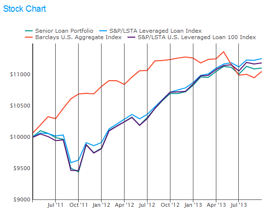
Shown here with the default theme applied.
Markup
<div class="widget">
                <h3>Stock Chart</h3>
                <div id="fundIndexes-chart"></div>
</div>

<div title="stockchart title" type="stockchart" target="fundIndexes-chart" class="chart hide" theme="default">
                <div class="data">sample-stockchart.json</div>
</div>
Bar Chart
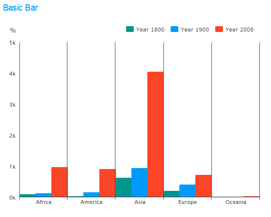
Shown here with the default theme applied.
Markup
<div class="widget">
                <h3>Basic Bar</h3>
                <div id="bar2"></div>
</div>

<div title="no-title-needed" type="barchart" target="bar2" class="chart hide">
                <div class="columns">['Africa', 'America', 'Asia', 'Europe', 'Oceania']</div>
                <div class="data">
                                [{
                                                name: 'Year 1800',
                                                data: [107, 31, 635, 203, 2]
                                }, {
                                                name: 'Year 1900',
                                                data: [133, 156, 947, 408, 6]
                                }, {
                                                name: 'Year 2008',
                                                data: [973, 914, 4054, 732, 34]
                                }]
                </div>

</div>
Pie Chart
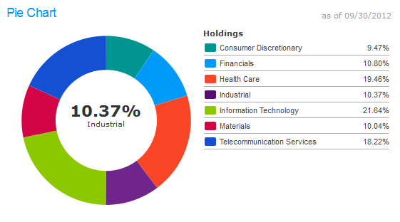
Shown here with the default theme applied.
Markup
<div class="widget">
                <div class="annotation muted pull-right">as of 09/30/2012</div>
                <h3>Pie Chart</h3>
                <div id="sector-chart"></div>
                <noscript>
                                <table id="sector-table" class="products-table table-striped">
                                                <thead>
                                                                <tr>
                                                                   <th class="text-left">Holdings</th>
                                                                   <th>% of Total Net Assets</th>
                                                                </tr>
                                                </thead>
                                                <tbody>
                                                                <tr>
                                                                   <td class="text-left">Consumer Discretionary</td>
                                                                   <td>9.47</td>
                                                                </tr>
                                                                <tr>
                                                                   <td class="text-left">Financials</td>
                                                                   <td>10.80</td>
                                                                </tr>
                                                                <tr>
                                                                   <td class="text-left">Health Care</td>
                                                                   <td>19.46</td>
                                                                </tr>
                                                                <tr>
                                                                   <td class="text-left">Industrial</td>
                                                                   <td>10.37</td>
                                                                </tr>
                                                                <tr>
                                                                   <td class="text-left">Information Technology</td>
                                                                   <td>21.64</td>
                                                                </tr>
                                                                <tr>
                                                                   <td class="text-left">Materials</td>
                                                                   <td>10.04</td>
                                                                </tr>
                                                                <tr>
                                                                   <td class="text-left">Telecommunication Services</td>
                                                                   <td>18.22</td>
                                                                </tr>
                                                </tbody>
                                </table>
                </noscript>
</div><!-- END / sector breakdown -->

<div title="Holdings" type="piechart" target="sector-chart" class="chart hide">
                <div class="data">
                                [
                                                ['Consumer Discretionary',9.47],
                                                ['Financials',10.80],
                                                ['Health Care',19.46],
                                                ['Industrial',10.37],
                                                ['Information Technology',21.64],
                                                ['Materials',10.04],
                                                ['Telecommunication Services',18.22]
                                ]
                </div>
</div>
The datepicker is tied to a standard form input field. Focus on the input (click, or use the tab key) to open an interactive calendar in a small overlay. Choose a date, click elsewhere on the page (blur the input), or hit the Esc key to close. If a date is chosen, feedback is shown as the input's value.
Screenshot
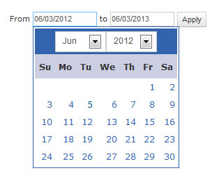
Shown here applied to an input with the input-skinny class.
Code
HTML
<div class="input-append">
                <input class="span2 datepicker" id="datepicker" type="date" />
                <span class="add-on"><a href="#" class="date-pick-button"><i class="icon icon-calendar"></i></a></span> </div>
            </div>
Javascript
$('input.datepicker').each( function() {
		$(this).datepicker({
			changeMonth: true,
			changeYear: true
		});
	});
For the form variation, please see the forms section below.
Dialogs simplify site functions by appearing as an overlay over existing page content. They may exist as one or multiple steps. They adopt the same rules as normal page content but feature a header and a close button. The background page 'dims' while dialogs are active. A black layer #000000 at 80% is used to create this effect.
Screenshot
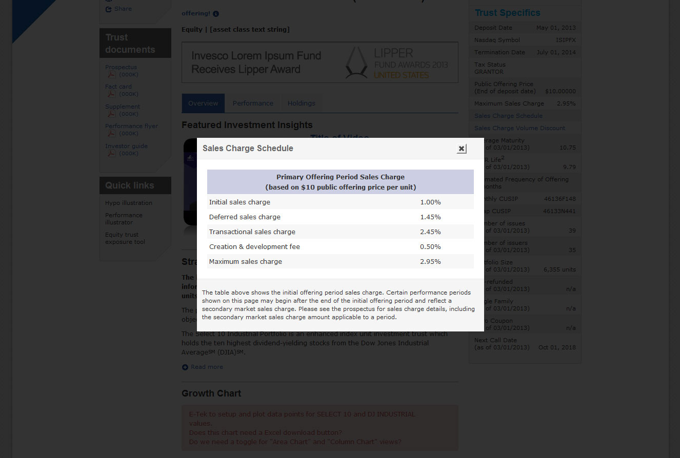
Shown here with a table embedded in the dialog-content-pattern element.
Markup
Link Markup
<a href="#" id="buttonIDNotImportant" target-dialog="dialogUniqueName">Link text</a>
Dialog Markup
<div id="dialogUniqueName" class="login hide dialog" title="Dialog Window Title" data-width="560">
	<div class="dialog-body">
		<div class="dialog-content-pattern">
        		[Dialog body content]
		</div>
		<div class="dialog-footer">
            		[Dialog footer content]
		</div>
	</div>
</div>
PLEASE NOTE: The dialog-content-pattern element is not needed if you are using a form inside the dialog-body.
For dialog boxes that contain forms that access data or web services (e.g. logins or email features), a request to eTech will be neccessary. A good example is the login dialog, found in the GlobalNav bar.
External Dialog Links
All links that point to external URLs (with the exception of the Invesco blog) require a disclaimer dialog. To generate the required dialog, add target-dialog="dialogExtLink" to the anchor tag.
Dropdowns are used when the labels of tabs are too long to fit within a span7 or if an alternative way of delivering content is needed. They can be used to enhance either tabs or pills, depending on the level of navigation in which the content appears.
Screenshot
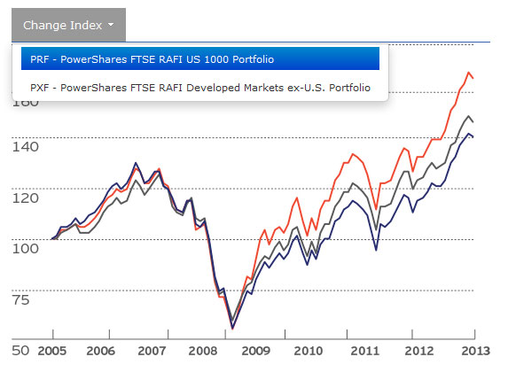
Shown here in conjunction with the tab element.
Markup
<ul class="nav nav-tabs">
              <li class="dropdown active">
                <a href="#" class="dropdown-toggle" data-toggle="dropdown">Change Index <b class="caret"></b></a>
                <ul class="dropdown-menu">
                  <li><a href="#dropdown1 active" data-toggle="tab">PRF - PowerShares FTSE RAFI US 1000 Portfolio</a></li>
                  <li><a href="#dropdown2" data-toggle="tab">PXF - PowerShares FTSE RAFI Developed Markets ex-U.S. Portfolio</a></li>
                </ul>
              </li>
            </ul>
            <div id="myTabContent" class="tab-content">

              <div class="tab-pane fade in active" id="dropdown1">
                <img src="http://invescopowershares.com/images/rafi/rafi_PRF.jpg" alt="Chart1" />
              </div>
              <div class="tab-pane fade" id="dropdown2">
                <img src="http://invescopowershares.com/images/rafi/rafi_PXF.jpg" alt="Chart2" />
              </div>
            </div>
In addition to the bootstrap icons, there are custom icons that are used in all columns.
PDF Icon
The pdf icon adds the proper margin and padding between the link title and the file size. It also applies a smaller font size to the file size.
Markup
<a href="#">Title of PDF <span class="pdf"></span></a>
Working off of the production-based design to add ancillaryt content to the Insights pages, we've developed a Responsive version that places the ancillary content at the top of the Insight on smaller viewports.
Screenshot
Markup
 <div class="span3 sidebar pull-right"> <div class="widget gray-bg alt-insights">
 	<h3> [&]nbsp;</h3>
    	<div class="subscribe-info" style="background-image: url(/static/sf/us/assets/img/insights-widget_greenwood.png);">
        	<div class="name">John Greenwood</div>
            <div class="title"> Chief Economist<br />
            Invesco Ltd.<br/><br/>
            </div>
            <br/>
 		</div>
 		<div class="clearfix"></div>
 		<div class="ascent"></div>
 </div>
 	<div class="widget gray-bg"> <h3>Quick Links</h3> <p>For a PDF of John Greenwood's complete 2015 outlook, download the PDF.</p> <p><a href="/static/us/contentdetail?contentId=a7123ce26fc31410VgnVCM100000c2f1bf0aRCRD" target="_blank">Download the PDF</a> <span class="pdf"></span></p>
 		<div class="ascent"></div>
 	</div>
 </div>
 <div class="span7 first-span"> <h3>Slow Money and Credit Growth Continue to Plague Global Economies</h3> [content]...
For Release 1 The Print and Share buttons will reside in thier own element at the top of the #sidebar column.
UPDATEFor Release 2 Briefcase functionality (for Insights and Product Overviews) and Email buttons have been added to the pattern.
Screenshot
Markup
 <div class="global-tools-bfc3 btn-toolbar">
	<div class="btn-group">
		<a href="javascript:window.print()" class="btn btn-small" id="tools-print"><i class="icon-print"></i></a>

		<a href="/static/us/briefcasecookie/us/add/advisor,69b6b19ab77f5410VgnVCM100000c2f1bf0aRCRD" id="tools-briefcase" class="btn btn-small  plus tools-briefcase-action" data-operation-type="add" data-link-type="widget" data-msg-container="addedtobriefcase"><i class="icon-briefcase-plus"></i></a>

		<a href="#" id="tools-mail" class="btn btn-small"><i class="icon-envelope"></i></a>
		<a href="javascript:void(0)" title="Toggle" class="btn btn-small share_button"><i class="icon-share"> </i></a>
	</div>
</div>
<span id='outer_container' class="outer_container">
	<ul class="share_option">
		<li><a href="#"><span class="google"> </span></a></li>
		<li><a href="#"><span class="linked"> </span></a></li>
		<li><a href="#"><span class="twitter"> </span></a></li>
		<li><a href="#"><span class="facebook"> </span></a></li>
	</ul>
</span>
<span class="previous-page">
	<a href="javascript:window.history.back()">
	<i class="icon-chevron-left"></i> Previous page</a>
</span>
<div id="addedtobriefcase" class="span2 action-briefcase alert alert-success hide">
	<p class="text-center"><span class="checkmark-green"></span></p>
	<p class="text-center">Added to Briefcase</p>
</div>
<div id="removedfrombriefcase" class="span2 action-briefcase alert alert-success hide">
	<p class="text-center"><span class="checkmark-green"></span></p>
	<p class="text-center">Removed</p>
</div>
	</div>
There are several role-specific style sheets for each role, depending on what role you are viewing as/logged in as. They are loaded via the JSP environment. Using one of the classes below will allow the wrapped content to only be viewable for that class.
Markup
<div class="role-investor">Investor-specific Content</div>
<div class="role-dc">Defined Contribution-specific Content</div>
<div class="role-ria">Registered Investment Advisor-specific Content</div>
<div class="role-institutional">Institution-specific Content</div>
<div class="role-advisor">Finanacial Professional-specific Content</div>
In order to display verified (or Hot) content, simply add the .verified class to the element.
Markup
<div class="role-investor verified">Only Investors that are logged in can see this content.</div>
In order to hide Warm content, add the .unverified class to the element. This will hide that element when in the Hot state.
Markup
<div class="role-investor unverified">Investors that are logged in will no longer see this content.</div>
In order to hide a smaller piece of content within a larger one, use .hide-[role] class to hide it from that role.
Markup
<div class="hide-investor">Users in the Investor role cannot see this content</div>
<div class="hide-dc">Users in the Defined Contribution role cannot see this content</div>
<div class="hide-ria">Users in the Registered Investment Advisor role cannot see this content</div>
<div class="hide-institutional">Users in the Institution role cannot see this content</div>
<div class="hide-advisor">Users in the Financial Professional role cannot see this content</div>
Subnavigation is a sub-level menu that compliments the top-level menu. It usually consists of links that is relevant and corresponds to the user's location on the site. For example, you see the menu on the left side of this page. The subnavigation shows links that fall under the Patterns category.
Screenshot
Markup
HTML
<div class="widget gray-bg">
          <ul class="nav nav-list">
            <li class="nav-header"><a href="">Menu Header with three lines of text</a></li>
            <li class=""><a href="#">Third Level</a></li>
            <li class=""><a href="#">Third Level with Two Lines</a></li>
            <li class="active"><a href="#">Third Level Active</a>
              <ul class="">
                <li class=""><a href="#">Fourth Level</a></li>
                <li class="active"><a href="#">Fourth Level with Two Lines Active</a>
				  <ul class="">
					<li class=""><a href="#">Fifth Level</a></li>
					<li class=""><a href="#">Fifth Level with Two Lines</a></li>
					<li class=""><a href="#">Fifth Level with Three Very Long Lines</a></li>
				  </ul>
				</li>
                <li class=""><a href="#">Fourth Level with Three Very Long Lines</a></li>
              </ul>
            </li>
            <li class=""><a href="#">Third Level with Three Very Long Lines</a></li>
            <li class=""><a href="#">Third Level with Two Lines</a></li>
            <li><a href="#">Third Level</a>
            <ul class="">
                <li><a href="#">Fourth Level</a></li>
                <li class=""><a href="#">Fourth Level with Two Lines</a></li>
                <li class=""><a href="#">Fourth Level with Three Very Long Lines</a></li>
              </ul>
              </li>
          </ul>
          <ul class="unstyled">
            <li><br />
            </li>
          </ul>
          <div class="ascent"></div>
        </div>
Tables use a light grey 1 pixel high line to divide rows; text is set in Verdana. There are two table styles, one for content (long) tables and one for shorter summary tables. Both styles use bold headers but the content tables include a rule above the header and have more padding.
Table markup
| Tag |
Description |
<table> |
Wrapping element for displaying data in a tabular format |
<thead> |
Container element for table header rows (<tr>) to label table columns |
<tbody> |
Container element for table rows (<tr>) in the body of the table |
<tr> |
Container element for a set of table cells (<td> or <th>) that appears on a single row |
<td> |
Default table cell |
<th> |
Special table cell for column (or row, depending on scope and placement) labels
Must be used within a <thead> |
<caption> |
Description or summary of what the table holds, especially useful for screen readers |
<table>
  <thead>
    <tr class="head">
      <th>…</th>
      <th>…</th>
    </tr>
  </thead>
  <tbody>
    <tr>
      <td>…</td>
      <td>…</td>
    </tr>
  </tbody>
</table>
Table options
| Name |
Class |
Description |
| Default |
None |
No styles, just columns and rows |
| Basic |
.table |
Only horizontal lines between rows |
| Bordered |
.table-bordered |
Rounds corners and adds outer border |
| Zebra-stripe |
.table-striped |
Adds light gray background color to odd rows (1, 3, 5, etc) |
| Condensed |
.table-condensed |
This will not apply from Bootstrap as the default table styling has been changed to reflect this style. |
Example tables
1. Default table styles
Tables are automatically styled with only a few borders to ensure readability and maintain structure. With 2.0, the .table class is required.
<table class="table">
  …
</table>
2. Striped table
Get a little fancy with your tables by adding zebra-striping—just add the .table-striped class.
Note: Striped tables use the :nth-child CSS selector and is not available in IE7-IE8.
<table class="table table-striped">
  …
</table>
3. Bordered table
Add borders around the entire tablefor aesthetic purposes.
<table class="table table-bordered">
  …
</table>
For navigation within the page, Tabs are used to divide content and therefore sit below the title module. Pills are used to navigate within an area of a page. Active tabs use the universal Invesco blue background. Non-active tabs use a lighter gray background. Tabs do not work within tabs on most mobile devices. Plese use the pills pattern when creating additional navigation inside tabs.
Top-level Tabs
HTML
<div class="tabbable"> <!-- Only required for left/right tabs -->
    <ul class="nav nav-tabs">
    	<li class="active"><a href="#tab1" data-toggle="tab">Section 1</a></li>
    	<li><a href="#tab2" data-toggle="tab">Section 2</a></li>
    </ul>
    <div class="tab-content">
    	<div class="tab-pane active" id="tab1">
    		<p>I'm in Section 1.</p>
    	</div>
   		<div class="tab-pane" id="tab2">
    		<p>Howdy, I'm in Section 2.</p>
    	</div>
    </div>
</div>
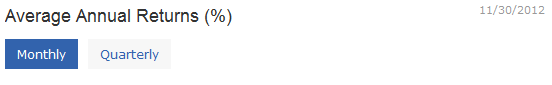
Pills
HTML
<ul class="nav nav-pills">
                    <li class="active"><a href="#monthly">Monthly</a></li>
                    <li><a href="#quarterly">Quarterly</a></li>
                    </ul>
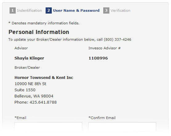
Thumbnail images have been built so that the same image can be used for all three views of an Article on a hub page: Top level (span7), Sub level (span3 or span4), or list view.
Screenshots
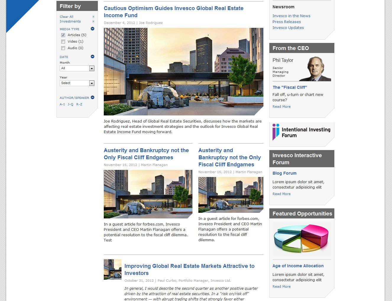
HTML
The html for top-level and sub-level are straightforward: the span# class dictates the width. The list view uses the panel-size-img class to crop the image.
<div class="media">
              <a href="" class="pull-left"><span class="panel-size-img"><img src="../assets/img/insights/glabal-real-estate.jpg" class="media-object"></span></a>
              <div class="media-body">
              <h3 class="tight media-heading"> <a href="">Improving Global Real Estate Markets Attractive to Investors</a> </h3>
              <p class="annotation muted"> October 31, 2012 | Paul Curbo, Portfolio Manager, Invesco Ltd. </p>
              <p><i>In general, I would describe the second quarter as another positive quarter driven by the attraction of real estate securities. In a "risk on/risk off" environment — with abrupt trading shifts that strongly favor either higher-risk asset classes (risk on) or lower-risk asset classes (risk off) — I think investors like real estate securities for these reasons:</i></p>
              <p><a href="">Read more about global real estate markets</a></p>
              </div>
              </div>
Brightcove Videos
In order for Brightcove to play within the https protocol and to be cross-broswer compatible, you will need to login to the Brightcove Video Cloud. Once logged in, click on the "Launch Media" button. Then Select or upload the video you want to use, click on the arrow next to "Quick Video Publish" (found on the right-hand side), and select "Chromeless Video Player" from the drop-down.
Then select JavaScript from the "Copy publishing code:" and copy the code. Change the first script to point to https://sadmin.brightcove.com/js/BrightcoveExperiences.js. Change the width and height parameters to the values below. Remove the last script (
Within the main-content column:
<div style="display:none">
</div>


<script language="JavaScript" type="text/javascript" src="https://sadmin.brightcove.com/js/BrightcoveExperiences.js"></script>

<object id="myExperience2838613408001" class="BrightcoveExperience">
  <param name="bgcolor" value="#FFFFFF" />
  <param name="width" value="540" />
  <param name="height" value="304" />
  <param name="playerID" value="2540257962001" />
  <param name="playerKey" value="AQ~~,AAACT2hXA8k~,vMlgAYmUQjcBeJYhtaQbn7s7qxjNvcin" />
  <param name="isVid" value="true" />
  <param name="isUI" value="true" />
  <param name="secureConnections" value="true" />
  <param name="secureHTMLConnections" value="true" />
  <param name="dynamicStreaming" value="true" />
  <param name="@videoPlayer" value="2838613408001" />
</object>
Within the secondary column:
  <param name="width" value="200" />
  <param name="height" value="113" />
YouTube Videos
For YouTube videos, simply grab the embed link from the video page.
Within the main-content column:
<div class="video-containter"> <iframe src="https://www.youtube.com/embed/JCih-wbBtwQ?rel=0" allowfullscreen=""></iframe></div>
Within the secondary column:
<div class="widget gray-bg">
		<div class="video-containter">
        	<iframe src="https://www.youtube.com/embed/JCih-wbBtwQ?rel=0" allowfullscreen="" frameborder="0" ></iframe>
        </div>
	<div class="ascent"></div>
</div>
NOTE: If you want to auto-play a video on pageLoad with a BrightCove video, you need to make that adjustment from within the player itself on Brightcove.com.
NOTE: Since the entire site is delivered via https protocol, make sure that your video URL is also https when using the YouTube method.
Widgets used in the .main-content column define subsets of information and break up the visual flow of the column with a gray top border.
Screenshot
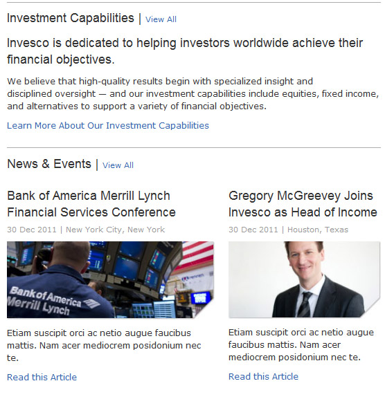
Taken from a Role landing page.
Markup
HTML
<div class="widget">
          <h3>Investment Capabilities | <a href="" class="view-all">View All</a></h3>
          <h3 class="normal">Invesco is dedicated to helping investors worldwide achieve their financial objectives.</h3>
          <p>We believe that high-quality results begin with specialized insight and disciplined oversight — and our investment capabilities include equities, fixed income, and alternatives to support a variety of financial objectives.</p>
          <p><a href="">Learn More About Our Investment Capabilities</a></p>
        </div>
        <div class="widget clearfix">
          <h3>News & Events | <a href="" class="view-all">View All</a></h3>
          <div class="span4 first-span">
            <h3 class="normal tight">Bank of America Merrill Lynch Financial Services Conference</h3>
            <p class="annotation muted">30 Dec 2011  |  New York City, New York</p>
            <img src="../assets/img/roles/news-4span.jpg" width="311" height="117" />
            <p class="news-info">Etiam suscipit orci ac netio augue faucibus mattis. Nam acer mediocrem posidonium nec te.</p>
            <p class="news-info"><a href="#">Read this Article</a></p>
          </div>
          <div class="span3">
            <h3 class="normal tight">Gregory McGreevey Joins Invesco as Head of Income</h3>
            <p class="annotation muted">30 Dec 2011  |  Houston, Texas</p>
            <img src="../assets/img/roles/news-3span.jpg" width="311" height="117" />
            <p class="news-info">Etiam suscipit orci ac netio augue faucibus mattis. Nam acer mediocrem posidonium nec te.</p>
            <p class="news-info"><a href="#">Read this Article</a></p>
          </div>
        </div>