Fonts
The website utilizes the brand typeface 'Invesco Interstate' for everything except body copy. Verdana is used for all the body copy; it is the secondary brand typeface and is more legible at smaller sizes.
Invesco Interstate
123ABCabc

Invesco Interstate bold
123ABCabc

Verdana Regular
123ABCabc

Verdana Bold
123ABCabc

Type Sizes
These are the core typefaces, sizes and colors used throughout the site. Refer to content elements to review paragraph spacing and layout variations.
H1

- Used for: Page titles
- Typeface: Invesco Interstate
- Size: 32 pixels
- Color: #fff
H2
- Used for: Page headers
- Typeface: Invesco Interstate
- Size: 24 pixels
- Line Height: 30 pixels
H3
- Used for: Page Sub-headers, Widget Titles
- Typeface: Invesco Interstate
- Size: 18 pixels
- Line Height: 24 pixels
H4
- Used for: Sub Sub-headers
- Typeface: Invesco Interstate
- Size: 14 pixels
- Line Height: 20 pixels
P

- Used for: Body copy
- Typeface: Verdana
- Size: 12 pixels
Links
All links are Invesco blue and turn a darker blue and are underlined when in the hover state.
P link

- Used for: Body copy links
- Typeface: Verdana
- Size: 12 pixels
- Color: #3263AD
- Hover color: #214172
- Hover text-decoration: Underline
Top Nav link
- Used for: Links in top navigation
- Typeface: Verdana
- Size: 12 pixels
- Color: #fff
- Hover color: #fff
- Hover text-decoration: Underline
Footer links

- Used for: Links in footer
- Typeface: Verdana
- Size: 12 pixels
- Color: #fff
- Hover color: #fff
- Hover text-decoration: underline
Icons by Glyphicons
Icon glyphs
140 icons in sprite form, available in Invesco Blue (default) and white, provided by Glyphicons. An extra 360 icons are provided by the GlyphIcons Pro package. Pro icons are added by request only.
How to use
All icons require an <i> tag with a unique class, prefixed with icon-. To use, place the following code just about anywhere:
<i class="icon-search"></i>
There are also styles available for inverted (white) icons, made ready with one extra class. We will specifically enforce this class on hover and active states for nav and dropdown links.
<i class="icon-search icon-white"></i>
Heads up!
When using beside strings of text, as in buttons or nav links, be sure to leave a space after the <i> tag for proper spacing.
Icon examples
Use them in buttons, button groups for a toolbar, navigation, or prepended form inputs.
Buttons
Button group in a button toolbar
<div class="btn-toolbar">
  <div class="btn-group">

    <a class="btn" href="#"><i class="icon-align-left"></i></a>
    <a class="btn" href="#"><i class="icon-align-center"></i></a>
    <a class="btn" href="#"><i class="icon-align-right"></i></a>
    <a class="btn" href="#"><i class="icon-align-justify"></i></a>
  </div>
</div>
Dropdown in a button group
<div class="btn-group">
  <a class="btn btn-primary" href="#"><i class="icon-user icon-white"></i> User</a>
  <a class="btn btn-primary dropdown-toggle" data-toggle="dropdown" href="#"><span class="caret"></span></a>
  <ul class="dropdown-menu">
    <li><a href="#"><i class="icon-pencil"></i> Edit</a></li>
    <li><a href="#"><i class="icon-trash"></i> Delete</a></li>
    <li><a href="#"><i class="icon-ban-circle"></i> Ban</a></li>
    <li class="divider"></li>
    <li><a href="#"><i class="i"></i> Make admin</a></li>
  </ul>
</div>
Small button
<a class="btn btn-small" href="#"><i class="icon-star"></i></a>
Navigation
<ul class="nav nav-list">
  <li class="active"><a href="#"><i class="icon-home icon-white"></i> Home</a></li>
  <li><a href="#"><i class="icon-book"></i> Library</a></li>
  <li><a href="#"><i class="icon-pencil"></i> Applications</a></li>
  <li><a href="#"><i class="i"></i> Misc</a></li>
</ul>
Form fields
<div class="control-group">
  <label class="control-label" for="inputIcon">Email address</label>
  <div class="controls">
    <div class="input-prepend">
    <span class="add-on"><i class="icon-envelope"><i><span><input class="span2" id="inputIcon" type="text">
  </div>
</div>
Using Icons with Text
Icons with text are used next to text links to help users quickly identify their function.
Tools Example
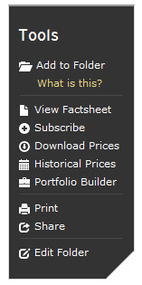
<ul class="unstyled">
            <li> <a href="#"> <i class="icon-white icon-folder-open"></i> Add to Folder</a> <a class="popover_link" href="#" rel="popover" data-content="Some explantation" data-original-title="A Title">What is this?</a> </li>
            <li class="divider"></li>
            <li> <a href="#"> <i class="icon-white icon-file"></i> View Factsheet </a> </li>
            <li> <a href="#"> <i class="icon-white icon-plus-sign"></i> Subscribe </a> </li>
            <li> <a href="#"> <i class="icon-white icon-download"></i> Download Prices </a> </li>
            <li> <a href="#"> <i class="icon-white icon-calendar"></i> Historical Prices </a> </li>
            <li> <a href="#"> <i class="icon-white icon-briefcase"></i> Portfolio Builder </a> </li>
            <li class="divider"></li>
            <li> <a href="#"> <i class="icon-print icon-white"></i> Print </a> </li>
            <li> <a href="#"> <i class="icon-white icon-share"></i> Share </a> </li>
            <li class="divider"></li>
            <li> <a href="#"> <i class="icon-white icon-edit"></i> Edit Folder </a> </li>
          </ul>
Star Rating Example
For the star rating appearance, we apply a helper class of .transparent, which applies a 40% opacity to to any element.
<i class="icon-star"></i>

<i class="icon-star"></i>

<i class="icon-star"></i>

<i class="icon-star transparent"></i>

<i class="icon-star transparent"></i>
Twitter Example
For icons that are required but not found in the Glyphicons package, such as the Twitter icon, we simply use the twitter png file.
<img src="../assets/img/roles/twitter-icon.png" />
Shared Documents Example
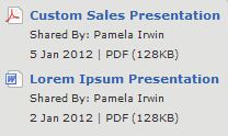
<a class="pdf" href="#"></a>

<a class="word" href="#"></a>
Shopping Cart Example
<a class="s_cart" href="#"></a>
Buttons
As a convention, buttons should only be used for actions while hyperlinks are to be used for objects. For instance, "Download" should be a button while "Cancel" should be a link.
The Primary button selection falls on the right, while the secondary button selection falls on the left and receives both .btn-small and .btn-link classes.
Example
Invesco buttons for a primary action and a default action.
Form buttons
Invesco form buttons for a primary action and a default action.
Multiple sizes
For fancy larger or smaller buttons, add .btn-large, .btn-small, or .btn-mini for two additional sizes.
Markup
<button class="btn btn-small btn-link">Cancel</button><button class="btn btn-primary">Continue</button>
Forms
Forms use a variation of the established table and interaction visual language to create consistency and present a clear, easy to follow form layout.
Form titles, form fields and existing data use dark grey text (hex color - #333).
Standard browser form elements like drop down lists and scroll bars are shown in an Invesco Global style. This is for demonstartion purposes. Many browsers do not allow custom designs for these elemnts. It is recommended to keep these as standard browser elements where possible.
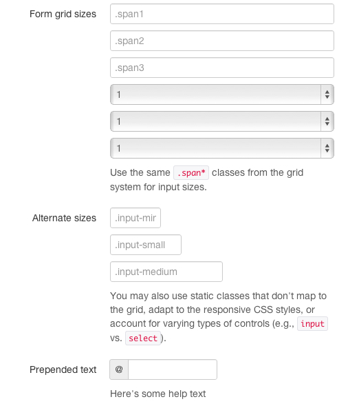
Screenshot
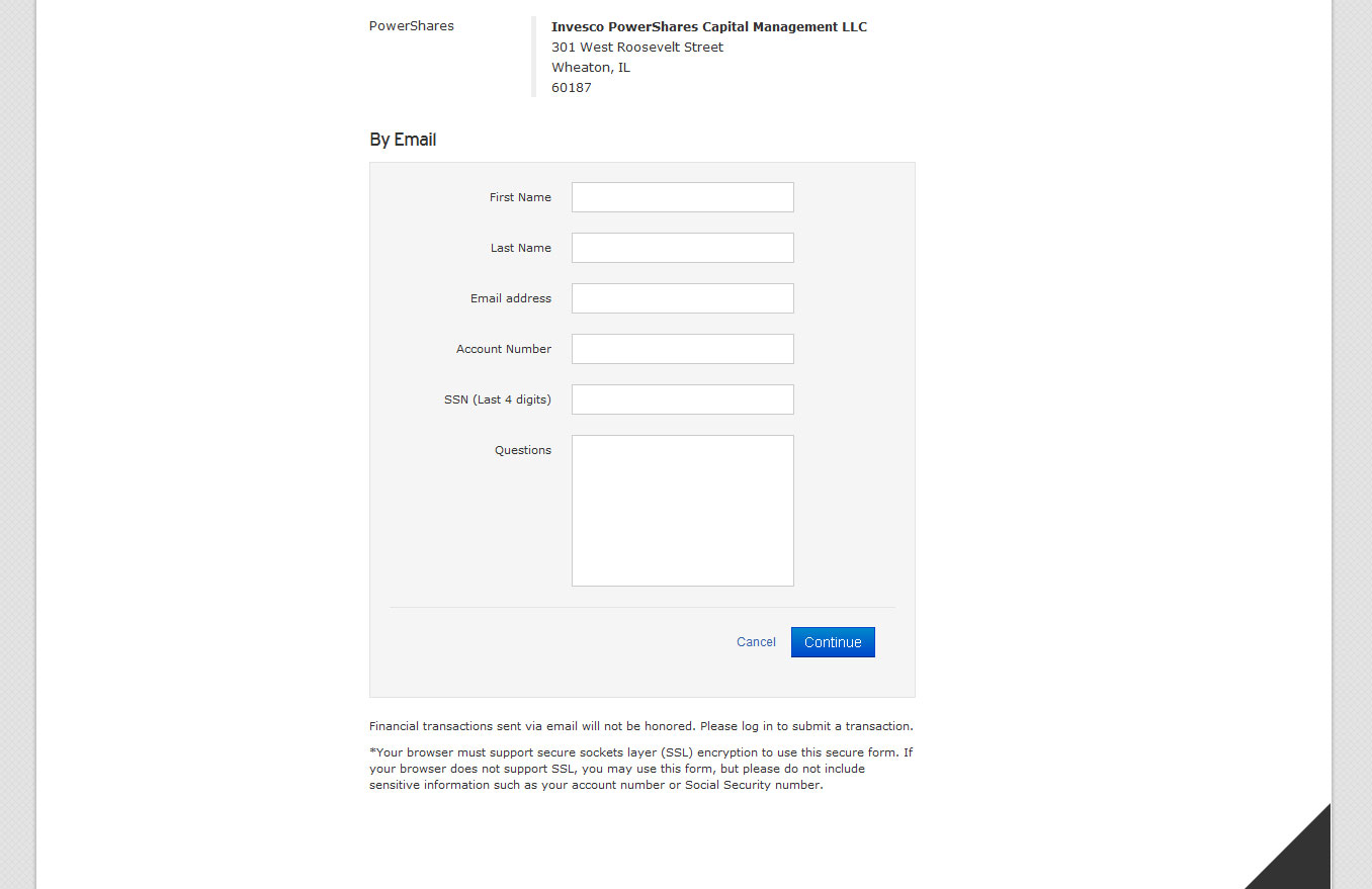
Four types of forms
Markup and styles for four styles of common web forms.
| Name | Class | Description |
|---|---|---|
| Vertical (default) | .form-vertical (not required) |
Stacked, left-aligned labels over controls |
| Inline | .form-inline |
Left-aligned label and inline-block controls for compact style |
| Search | .form-search |
Extra-rounded text input for a typical search aesthetic |
| Horizontal | .form-horizontal |
Float left, right-aligned labels on same line as controls |
Example of three forms using just form controls, no extra markup
Search forms
Add .form-search to the form and .search-query to the input.
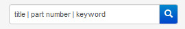
Search form markup
<form class="well form-inline">
                  <div class="input-append pull-right">
                  <input type="text" class="" onfocus="if(this.value =='title | part number | keyword' ) this.value=''" onblur="if(this.value=='') this.value='title | part number | keyword'" value="title | part number | keyword" placeholder="title | part number | keyword" id="appendedInput">
                  <span class="add-on btn-primary"><i class="icon-white icon-search"></i></span>
                  </div>
                  <div class="clearfix"></div>
                  </form>
Inline forms
Add .form-inline to finesse the vertical alignment and spacing of form controls.
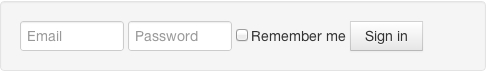
Inline from markup
<form class="well form-inline">
  <input type="text" class="input-small" placeholder="Email">
  <input type="password" class="input-small" placeholder="Password">
  <label class="checkbox">
    <input type="checkbox"> Remember me
  </label>
  <button type="submit" class="btn">Sign in</button>
</form>
Horizontal forms

Horizontal form markup
Given the example form layout, here's the markup associated with the first input and control group. The .control-group, .control-label, and .controls classes are all required for styling.
<form class="well form-horizontal">
  <fieldset>
    <div class="control-group">
      <label class="control-label" for="input01">Text input</label>
      <div class="controls">
        <input type="text" class="input-xlarge" id="input01">
        <p class="help-block">Supporting help text</p>
      </div>
    </div>
  </fieldset>
</form>
Vertical forms
Vertical form markup
Given the example form layout, here's the markup for the whole form. The .control-group, .control-label, and .controls classes are all required for styling.
<form class="well form-vertical">
          <fieldset>
            <legend>Enter Account Information:</legend>
            <div class="span3">
              <label class="control-label" for="input01"><span class="required_field">*</span>First Name</label>
              <input class="span3" id="input01" type="text" />
            </div>
            <div class="span3">
              <label class="control-label" for="lastname"><span class="required_field">*</span>Last Name</label>
              <input class="span3" id="lastname" type="text" />
            </div>
            <div class="span3">
              <label class="control-label" for="ssntax"><span class="required_field">*</span>SSN/Tax ID</label>
              <input class="span3" id="ssntax" type="number" />
            </div>
            <div class="span3">
              <label class="control-label" for="accountnumber"><span class="required_field">*</span>Account Number</label>
              <input class="span3" id="accountnumber" type="number" />
            </div>
            <div class="span3">
              <label class="control-label" for="email"><span class="required_field">*</span>Email Field</label>
              <input class="span3" id="email" type="email" />
            </div>
            <div class="span3">
              <label class="control-label" for="email"><span class="required_field">*</span>Verify Email Field</label>
              <input class="span3" id="email" type="email" />
            </div>
            <div class="span3">
              <label class="control-label" for="date"><span class="required_field">*</span>Date Field</label>
              <div class="input-append">
                <input class="span2 datepicker" id="datepicker" type="date" />
                <span class="add-on"><a href="#" class="date-pick-button"><i class="icon icon-calendar"></i></a></span> </div>
            </div>
            <div class="span3">
              <label class="control-label" for="email"><span class="required_field">*</span>Phone Field</label>
              <span class="phone-fields">(</span><input class="span1" id="phone" type="tel" pattern="\d{3}" title="Area code: 999" /><span class="phone-fields">)</span> <input class="span1" id="phone" type="tel" pattern="\d{3}" title="First three digits: 999" /> <span class="phone-fields">–</span> <input class="span1" id="phone" type="tel" pattern="\d{4}" title="Last four digits: 9999" /></span>
            </div>
            <div class="clearfix"></div>
            <div class="form-actions">
              <div class="pull-right">
                <button class="btn btn-small btn-link">Cancel</button>
                <button class="btn btn-primary" type="submit">Continue</button>
              </div>
            </div>
          </fieldset>
        </form>
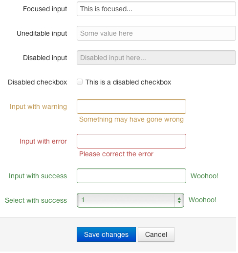
Form control states
Invesco features styles for browser-supported focused and disabled states. We remove the default Webkit outline and apply a box-shadow in its place for :focus.
Form validation
Invesco uses HTML5 input types to enhance the mobile/tablet experience and to make use of HTML5 client-side validation in HTML5-compliant browsers.
The following lists all the possible HTML5 input types currently available. The ones highlighted in green are types that are commonly used in forms on our site:
- color
- date
- datetime
- datetime-local
- month
- number
We also include validation styles for errors, warnings, and success. To use, add the error class to the surrounding .control-group.
<fieldset
  class="control-group error">
  ...
</fieldset>
Extending form controls
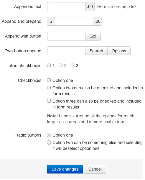
Prepend & append inputs
Input groups—with appended or prepended text—provide an easy way to give more context for your inputs. Great examples include the @ sign for Twitter usernames or $ for finances.
Checkboxes and radios
Simply repeat the <label class="checkbox"> that wraps the <input type="checkbox">.
Inline checkboxes and radios are also supported. Just add .inline to any .checkbox or .radio and you're done.
Inline forms and append/prepend
To use prepend or append inputs in an inline form, be sure to place the .add-on and input on the same line, without spaces.
Form help text
To add help text for your form inputs, include inline help text with <span class="help-inline"> or a help text block with <p class="help-block"> after the input element.